When it comes to vehicle signwriting design, it isn't about making something look "nice".
It's about making it work.
Your vehicle is often seen for three seconds or less - driving past, parked on a street, or sitting in traffic.
In that short window, your design has one job:
- 👉 Grab attention
- 👉 Communicate the message
- 👉 Make it easy to find out more
Get this right and your van becomes a powerful marketing tool.
Get it wrong and it becomes visual noise that people forget instantly.
This guide breaks down the five essential steps to creating a vehicle signwriting design that is clean, confident, and memorable.
Step 1: The Background Design - Grabbing Attention (If Budget Allows)
The background is the foundation of your entire design.
If budget allows, using a background colour, panel, or printed design (rather than plain white paintwork) helps your vehicle stand out immediately - especially on busy streets or industrial areas.
Good background design:
- Creates contrast for text and logos
- Makes the vehicle more noticeable at distance
- Helps the branding feel intentional, not "stuck on"
- Creating a two tone vehicle immediately stands out as different
- Using corporate colours can really strengthen local brand awareness
Having a background design doesn't have to mean a full wrap.
Even partial background panels, colour blocks, or subtle textures can dramatically increase impact.
A favourite is the rear panels & rear quarters, especially with sharp angles - this creates a dynamism and energy to the design and triggers positive emotional responses in customers.
Key Principle
The background should support the message, embolden - not overpower it.
Bold doesn't mean busy. Often, just a simple colour contrast is more effective than complex graphics.
There are over 100 designs within the gallery - what style matches the look & feel you are looking for?
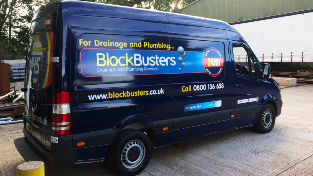
Step 2: Present the Logo Clearly in Your Vehicle Signwriting Design (Not Creatively)
Your logo matters - but only if it's clear and readable.
One of the most common mistakes in vehicle signwriting design is over-stylising the logo or placing it where it's hard to see.
Your logo should:
- Be instantly recognisable
- Have strong contrast against the background
- Be placed where the eye naturally goes (usually sides and rear)
This is not the place for creative experimentation.
A vehicle is not a website or a brochure.
If someone has to "work" to understand your logo, they won't bother - they'll just keep driving or walking by.
Rule of Thumb
If your logo isn't readable & understandable at a glance from across the road, it's not doing its job.
Step 3: Clearly Say What You Do in Your Vehicle Signwriting Design
This is where most vehicle signwriting designs fail.
People shouldn't have to guess what you do.
Alongside your logo, you need:
- A clear strapline (plain English beats clever wording)
- 3 or 4 key services at most
For example:
- Plumbing • Heating • Bathrooms
- Electrical Installations • Fault Finding • Testing
- Commercial Cleaning • Offices • Schools
Why only 3 or 4?
Because your van is seen for seconds, not minutes.
Trying to list everything you do leads to:
- Smaller text
- Visual clutter
- Confusion
Clarity Beats Completeness
Your goal is recognition, not explanation.
Focus on the jobs that make the money, not trying to communicate all the things you can do. Websites and phone calls can expand on the "what" - the vehicle is just trying to generate the interest.
Step 4: Show Where You Operate (Local Builds Trust)
A mobile phone number fails to communicate the "local" trades person.
01273 is a very big geographical area.
If you drive to Newhaven at the weekend to see a friend, but you work in Shoreham-by-Sea and the local 5 mile area, how does the person who is interested in your services having seen your van in Newhaven know you don't travel for work beyond Brighton?
Including your operating area helps potential customers quickly answer the question:
"Do they work near me?"
This could be:
- A list of towns
- A simple phrase like "serving East Sussex" (West Sussex, or Mid Sussex)
- Or "serving 10 mile radius from Haywards Heath"
This small detail adds credibility and relevance - especially for trades and service businesses focused on small geographical areas.
It reassures people that you're not "just passing through".
Step 5: Calls to Action (CTA) - Less Is More
This is where restraint really matters.
Your call to action should be simple, obvious, and minimal.
The priority CTAs should be:
- Website address
- Landline telephone number
Why these two?
- A website gives people a low-pressure way to find out more
- A website reinforces your company name
- A website is better looking than a telephone number - graphically it just is!
- A website is far easier to remember than a telephone number
- A website has Telephone Number, Email and Address easy to find
- A landline number signals professionalism and trust
- But does a prospect call you without any further research first?
- If a lower value sale maybe, but if a customer is likely to want to research more, understand better what you do, read reviews then don't distract with a telephone number - just encourage the visit to your website.
Avoid cluttering the design with:
- Multiple phone numbers - unless this is really the PRIMARY call to action you expect a prospect to take
- Email addresses - unless this is really the PRIMARY call to action you expect a prospect to take
- Social media icons - your work vehicle is not a business card, brochure or website. Does having Facebook and Instagram logos on your van really add value?
- QR codes everywhere - QR codes can be very clever, but they are not visually attractive and add very little to the visual appeal of a vehicle signwriting design
Too many choices cause hesitation.
Hesitation kills response but also too many choices leads to none being remembered or recalled.
No.1 Call to Action
Website every time, unless of course you & your customers are not web based.
One clear next step always beats five confusing ones.
The 3-Second Rule (The Most Important Rule of All)
Every vehicle signwriting design should pass this test:
If someone sees your van for three seconds, from 10 metres away can they understand who you are, what you do, and how to find out more?
If the answer is yes - the design works.
If not, it needs simplifying.
Final Vehicle Signwriting Design Thought
The perfect vehicle signwriting design isn't about squeezing everything on.
It is neither a website, a business card nor a corporate brochure.
It's about:
- Attention
- Clarity
- Action
A clean, well-thought-out design will always outperform a busy one - especially when your van is out in the real world doing its job every day.
Ready to Get Your Vehicle Signwriting Design Right?
If you'd like help designing a vehicle that actually works as a marketing tool (not just something that looks "nice"), The Sussex Sign Company has 30 years experience and a graphic department with two full time designers.
We're always happy to talk through your thoughts & ideas & help you bring your van to life.